10 Features of Flat Design You Shouldn’t Forget About
Flat design is becoming more popular because it looks rather stylish.
It may look as if it is simply an easy and cheap way of creating a website, but it is actually quite difficult to create a flat design and not have it look bad.
Creating a classy and/or stylish flat design takes a lot of skill; otherwise, it just looks cheap and tacky.
Here are 10 features that you should remember when building your flat design.
1 – Keep navigation elements in their intuitive place
It may spoil your flat design a little bit if you have to put your search bar at the top of the page, but that is where people expect it to be. Stick with some of the usual design conventions, and understand that sometimes you have to sacrifice your artistic sensibilities in the name of usability.
2 – Make sure it is user-friendly
It has to be user-friendly and slightly more initiative than usual, as it is very easy to turn your flat design into a flat page puzzle. A flat design must be easy to read, use and interpret, otherwise what is the point of making it flat in the first place? Make sure that it is easy to skim read, easy to understand and easy to navigate. A flat design that is hard to understand is going to scare away your viewers.
3 – Do not add in any added effects
It removes the point of creating a flat website in the first place. Do not add in any animations within your navigation menus or within the buttons. Do not have moving or flashing parts (they are tacky anyway), and do not include any sort of shadowing. If you are adding effects then you are blurring the lines between flat and mainstream design.
4 – Simplicity is your key to success
Do not forget that flat design has to have all of the tell-tale signs of a simple interface. It is all part of being a flat design, since it may look a little childlike or amateurish if you have tried to make it complex. It may look as if you wanted to create a mainstream website but did not have the skill. Instead, you want your flat design to make a statement about your core values or website purpose.
5 – Web content rules still apply
In other words, just because you have created a fancy flat design, does not mean that the rules of content do not apply to you. It may spoil the overall layout of your design if you have to squeeze text into it, but this is something that you have to do. Do not fill your pages with flimsy or wispy content because filling it with more than 200 words is going to spoil the overall style or look of your design.
6 – Skim reading should be easier with a flat design
This is a very good point, as a flat design is supposed to be uncomplicated and simple, so skim-reading should be even easier on a flat website than on a regular website. If this is not the case, then you may be making a very big mistake. Make sure there are no big lumps of text just sitting there, or that the writing is too small in places.
7 – Keep important elements at the top
There is nothing wrong with being creative when you create your flat design, and there is nothing wrong with challenging a few design conventions. But, it is still better if you keep your important elements at the top of the website. Do not forget that the user may be very impressed with your design, but that subsequent visits are going to be for the content and the important page elements, and not for the design.
8 – Keep it spaced out
The biggest problem with flat designs is that they are too easy to condense. Flat design will look more condensed than regular websites, and so you need to create extra space to compensate for the crowded visual effect. Plus, the flat designs with more space are often the ones that look the best anyway.
9 – The flat design should only leave an impression
This is a very important factor, as many designers think that their designs are so cutting edge that people are going to come back to see it. But, this is not the case, as people are going to come back for the content (or not). This means you should make an impression with your design, and one that helps to grow the website brand but remember that the design is there for the content and not as the main traffic draw.
10 – Navigation is still key
A well designed flat design is easy to navigate. Luckily, most flat designs lend themselves very well to great navigation. You just have to make sure that your artistic urges do not get in the way. This means that you should still make your links and buttons easy to see, even if they throw your designs a little off-center.
Author’s bio:
The guest post is written by Sonia Jackson from http://www.cool-essays.com. She writes essays on different topics and can give you useful advice.
 https://hfbadvertising.com/wp-content/uploads/2017/09/mortgage-marketing-materials-designer.jpg
800
1200
HFB Advertising
https://hfbadvertising.com/wp-content/uploads/2016/06/hfb-advertising-design-logo-header-1.png
HFB Advertising2025-06-10 11:16:582025-06-10 14:47:46Effective Mortgage Marketing Strategies to Grow Your Business
 https://hfbadvertising.com/wp-content/uploads/2025/05/small-business-owner-designing-diy-website.jpg
300
300
HFB Advertising
https://hfbadvertising.com/wp-content/uploads/2016/06/hfb-advertising-design-logo-header-1.png
HFB Advertising2025-05-22 17:24:432025-05-23 14:02:51DIY Small Business Website Guide
 https://hfbadvertising.com/wp-content/uploads/2025/03/top-10-promo-products-2025-banner.jpg
180
180
HFB Advertising
https://hfbadvertising.com/wp-content/uploads/2016/06/hfb-advertising-design-logo-header-1.png
HFB Advertising2025-05-22 14:19:032025-05-29 14:30:41Top 10 Must-Have Promotional Products for 2025
 https://hfbadvertising.com/wp-content/uploads/2023/03/tradeshow-giveaways-promotional-products.jpg
1200
1200
HFB Advertising
https://hfbadvertising.com/wp-content/uploads/2016/06/hfb-advertising-design-logo-header-1.png
HFB Advertising2025-02-11 09:02:332025-05-29 14:32:505 Tradeshow Giveaways and Promotional Products
 https://hfbadvertising.com/wp-content/uploads/2024/03/professional-graphic-designer.jpg
200
300
HFB Advertising
https://hfbadvertising.com/wp-content/uploads/2016/06/hfb-advertising-design-logo-header-1.png
HFB Advertising2024-04-03 13:03:532025-05-23 14:16:47A Guide to Hiring a Professional Graphic Designer for Your Business
Getting Your Project Ready for Printing: A Print Production Checklist
Direct Mail & Print Advertising https://hfbadvertising.com/wp-content/uploads/2024/03/hiring-logo-designer.jpg
412
300
HFB Advertising
https://hfbadvertising.com/wp-content/uploads/2016/06/hfb-advertising-design-logo-header-1.png
HFB Advertising2024-03-21 14:11:072025-05-29 14:35:09The Ultimate Guide to Hiring a Logo Designer
 https://hfbadvertising.com/wp-content/uploads/2024/03/advertising-examples.jpg
225
400
HFB Advertising
https://hfbadvertising.com/wp-content/uploads/2016/06/hfb-advertising-design-logo-header-1.png
HFB Advertising2024-03-13 13:58:122025-05-23 10:23:3110 Best Advertising Examples for Small Business Growth
 https://hfbadvertising.com/wp-content/uploads/2023/09/real-estate-marketing-materials.jpg
378
504
HFB Advertising
https://hfbadvertising.com/wp-content/uploads/2016/06/hfb-advertising-design-logo-header-1.png
HFB Advertising2023-09-22 08:55:072025-05-28 14:30:2111 Must Have Real Estate Marketing Materials
 https://hfbadvertising.com/wp-content/uploads/2017/01/brochure-design.jpg
200
300
HFB Advertising
https://hfbadvertising.com/wp-content/uploads/2016/06/hfb-advertising-design-logo-header-1.png
HFB Advertising2023-09-11 09:27:352025-05-23 10:41:255 Brochure Design Tips For Success
 https://hfbadvertising.com/wp-content/uploads/2023/09/custom-pens.jpg
887
800
HFB Advertising
https://hfbadvertising.com/wp-content/uploads/2016/06/hfb-advertising-design-logo-header-1.png
HFB Advertising2023-09-06 12:44:472025-05-23 13:54:09Custom Pens: Adding a Splash of Positivity to Your Brand
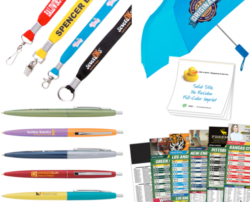 https://hfbadvertising.com/wp-content/uploads/2023/08/50-best-promotional-items-to-give-away.jpg
700
700
HFB Advertising
https://hfbadvertising.com/wp-content/uploads/2016/06/hfb-advertising-design-logo-header-1.png
HFB Advertising2023-08-22 11:07:122025-05-31 07:24:1650 Best Promotional Items to Give Away
 https://hfbadvertising.com/wp-content/uploads/2017/01/direct-mail-roi.jpg
180
180
HFB Advertising
https://hfbadvertising.com/wp-content/uploads/2016/06/hfb-advertising-design-logo-header-1.png
HFB Advertising2023-08-08 13:22:372025-05-23 13:46:49How To Calculate Direct Mail ROI For Marketing
 https://hfbadvertising.com/wp-content/uploads/2023/07/school-spirit.jpg
648
725
HFB Advertising
https://hfbadvertising.com/wp-content/uploads/2016/06/hfb-advertising-design-logo-header-1.png
HFB Advertising2023-07-27 10:38:342025-05-28 14:24:02Promotional Items For College: Boosting University Spirit
 https://hfbadvertising.com/wp-content/uploads/2016/08/local-seo.jpg
201
302
HFB Advertising
https://hfbadvertising.com/wp-content/uploads/2016/06/hfb-advertising-design-logo-header-1.png
HFB Advertising2023-07-05 10:40:482025-05-23 13:37:15Boost Your Local SEO Ranking with These 11 Expert Tips
 https://hfbadvertising.com/wp-content/uploads/2023/05/drawstring-backpack-1.png
754
720
HFB Advertising
https://hfbadvertising.com/wp-content/uploads/2016/06/hfb-advertising-design-logo-header-1.png
HFB Advertising2023-05-24 10:00:002025-05-28 14:21:29Promotional Bags: Elevate Your Brand with Sustainable Swag
 https://hfbadvertising.com/wp-content/uploads/2023/05/online-printing-vs-printing-near-me.jpg
700
1280
HFB Advertising
https://hfbadvertising.com/wp-content/uploads/2016/06/hfb-advertising-design-logo-header-1.png
HFB Advertising2023-05-04 13:20:582025-05-23 13:33:49Best Printing Service: Online Printing vs Printing Near Me
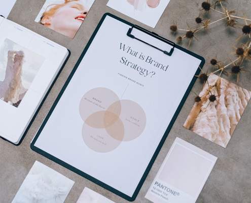 https://hfbadvertising.com/wp-content/uploads/2023/04/10-branding-strategies-to-get-your-small-business-noticed.jpg
1079
720
HFB Advertising
https://hfbadvertising.com/wp-content/uploads/2016/06/hfb-advertising-design-logo-header-1.png
HFB Advertising2023-04-20 10:00:002025-05-23 10:25:1710 Branding Strategies to Get Your Small Business Noticed
 https://hfbadvertising.com/wp-content/uploads/2018/03/marketing-materials.jpg
426
640
HFB Advertising
https://hfbadvertising.com/wp-content/uploads/2016/06/hfb-advertising-design-logo-header-1.png
HFB Advertising2023-04-17 14:51:462025-05-28 14:11:37Best Types of Marketing Materials You Should Have for Your Business
 https://hfbadvertising.com/wp-content/uploads/2016/10/marketing-materials.jpg
200
300
HFB Advertising
https://hfbadvertising.com/wp-content/uploads/2016/06/hfb-advertising-design-logo-header-1.png
HFB Advertising2023-04-17 14:49:162025-05-23 12:11:366 Marketing Materials Ideas to Use to Make your Business Grow Faster
 https://hfbadvertising.com/wp-content/uploads/2023/04/real-estate-promotional-ideas.jpg
1080
720
HFB Advertising
https://hfbadvertising.com/wp-content/uploads/2016/06/hfb-advertising-design-logo-header-1.png
HFB Advertising2023-04-13 10:00:002025-05-28 14:31:38Real Estate Promotional Ideas to Boost Your Business
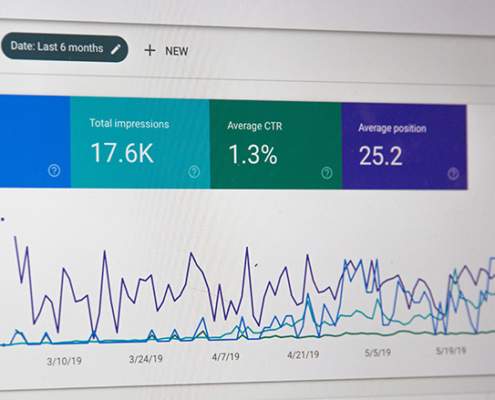 https://hfbadvertising.com/wp-content/uploads/2023/03/how-to-do-seo.jpg
439
720
HFB Advertising
https://hfbadvertising.com/wp-content/uploads/2016/06/hfb-advertising-design-logo-header-1.png
HFB Advertising2023-04-06 10:00:002025-05-23 14:39:32How To Do SEO
 https://hfbadvertising.com/wp-content/uploads/2023/03/why-is-graphic-design-important-for-a-business.jpg
489
720
HFB Advertising
https://hfbadvertising.com/wp-content/uploads/2016/06/hfb-advertising-design-logo-header-1.png
HFB Advertising2023-03-30 10:00:002025-05-30 09:51:55Why Is Graphic Design Important For A Business?
Dentist Marketing Tips For Your New and Existing Practice: Attract & Retain Patients
SEO & Digital Marketing https://hfbadvertising.com/wp-content/uploads/2023/03/6-types-of-logo-designs-for-your-brand-scaled.jpg
1707
2560
HFB Advertising
https://hfbadvertising.com/wp-content/uploads/2016/06/hfb-advertising-design-logo-header-1.png
HFB Advertising2023-03-16 09:00:002025-05-23 12:12:046 Types of Logo Designs for Your Brand
 https://hfbadvertising.com/wp-content/uploads/2023/03/can-ai-replace-graphic-designers.jpg
428
640
HFB Advertising
https://hfbadvertising.com/wp-content/uploads/2016/06/hfb-advertising-design-logo-header-1.png
HFB Advertising2023-03-09 10:00:002025-05-23 13:47:51Can AI Replace Graphic Designers? Will AI Take Over the Design Industry?
 https://hfbadvertising.com/wp-content/uploads/2013/08/promotional-giveaway-1-e1681149610954.jpg
384
300
HFB Advertising
https://hfbadvertising.com/wp-content/uploads/2016/06/hfb-advertising-design-logo-header-1.png
HFB Advertising2023-02-16 10:00:002025-05-23 10:29:4210 Tips Why Use Promotional Products
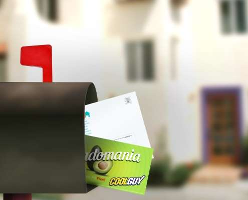 https://hfbadvertising.com/wp-content/uploads/2022/01/EDDM-03-scaled.jpg
2560
1978
HFB Advertising
https://hfbadvertising.com/wp-content/uploads/2016/06/hfb-advertising-design-logo-header-1.png
HFB Advertising2023-02-09 11:17:482025-05-30 09:32:47What Is Direct Mail?
 https://hfbadvertising.com/wp-content/uploads/2023/02/custom-label-water-bottle.jpg
496
750
HFB Advertising
https://hfbadvertising.com/wp-content/uploads/2016/06/hfb-advertising-design-logo-header-1.png
HFB Advertising2023-02-03 13:42:322025-05-23 13:35:16Best Promotional Products For Your Business In 2023
 https://hfbadvertising.com/wp-content/uploads/2014/05/why-you-need-monthly-seo-services-for-your-business.jpg
333
500
HFB Advertising
https://hfbadvertising.com/wp-content/uploads/2016/06/hfb-advertising-design-logo-header-1.png
HFB Advertising2023-02-01 09:51:342025-05-28 14:14:02Why you need monthly SEO services for your business?
 https://hfbadvertising.com/wp-content/uploads/2016/03/logo-sketch.jpg
425
640
HFB Advertising
https://hfbadvertising.com/wp-content/uploads/2016/06/hfb-advertising-design-logo-header-1.png
HFB Advertising2023-01-19 10:00:002025-05-23 12:03:235 Logo Design Tips and Techniques
Hiring An Advertising Agency Is Important For Businesses Success. See Why?
General Marketing & Advertising https://hfbadvertising.com/wp-content/uploads/2017/12/seo-checklist-1.jpg
331
640
HFB Advertising
https://hfbadvertising.com/wp-content/uploads/2016/06/hfb-advertising-design-logo-header-1.png
HFB Advertising2022-10-27 09:00:002025-05-29 14:07:37SEO Checklist For Small Business Websites
 https://hfbadvertising.com/wp-content/uploads/2016/09/business-advertising.jpg
200
300
HFB Advertising
https://hfbadvertising.com/wp-content/uploads/2016/06/hfb-advertising-design-logo-header-1.png
HFB Advertising2022-06-17 10:00:002025-05-23 10:34:0510 Ways Business Advertising Can Increase Your Sales
 https://hfbadvertising.com/wp-content/uploads/2017/02/web-design.jpg
183
300
HFB Advertising
https://hfbadvertising.com/wp-content/uploads/2016/06/hfb-advertising-design-logo-header-1.png
HFB Advertising2022-02-10 09:00:002025-05-30 09:02:29Web Design: Everything You Need To Know
 https://hfbadvertising.com/wp-content/uploads/2016/09/promotional-products.jpg
750
750
HFB Advertising
https://hfbadvertising.com/wp-content/uploads/2016/06/hfb-advertising-design-logo-header-1.png
HFB Advertising2022-01-17 10:00:002025-05-23 12:30:577 Promotional Products Ideas To Help Your Business Grow
 https://hfbadvertising.com/wp-content/uploads/2018/09/website-design-cost.jpg
200
300
HFB Advertising
https://hfbadvertising.com/wp-content/uploads/2016/06/hfb-advertising-design-logo-header-1.png
HFB Advertising2021-10-27 09:00:002025-05-23 14:17:53How Much Should a Website Design Cost?
 https://hfbadvertising.com/wp-content/uploads/2014/06/company-website-address-besides-your-website.jpg
220
400
HFB Advertising
https://hfbadvertising.com/wp-content/uploads/2016/06/hfb-advertising-design-logo-header-1.png
HFB Advertising2020-12-02 09:00:332025-05-30 09:43:55Where to Put Your Company Website Address besides Your Website
 https://hfbadvertising.com/wp-content/uploads/2016/06/business-blog.jpg
400
600
HFB Advertising
https://hfbadvertising.com/wp-content/uploads/2016/06/hfb-advertising-design-logo-header-1.png
HFB Advertising2020-04-10 12:00:002025-05-23 13:41:37How To Start A WordPress Business Blog In 11 Easy Steps
 https://hfbadvertising.com/wp-content/uploads/2014/03/infographic.jpg
200
300
HFB Advertising
https://hfbadvertising.com/wp-content/uploads/2016/06/hfb-advertising-design-logo-header-1.png
HFB Advertising2020-03-08 11:00:002025-05-23 12:38:345 Online Tools That Will Help Create Awesome Infographics To Share
 https://hfbadvertising.com/wp-content/uploads/2014/03/tips-for-optimizing-your-online-shopping-cart-image.png
300
300
HFB Advertising
https://hfbadvertising.com/wp-content/uploads/2016/06/hfb-advertising-design-logo-header-1.png
HFB Advertising2020-01-07 08:00:002025-05-29 14:29:15Tips for Optimizing Your Online Shopping Cart
 https://hfbadvertising.com/wp-content/uploads/2013/12/what-is-pay-per-click-marketing-pay-per-click-ads.jpg
200
300
HFB Advertising
https://hfbadvertising.com/wp-content/uploads/2016/06/hfb-advertising-design-logo-header-1.png
HFB Advertising2019-09-26 10:00:052025-05-30 09:36:47What is Pay Per Click Marketing and Pay Per Click Ads
 https://hfbadvertising.com/wp-content/uploads/2015/03/logo-design-8.jpg
500
960
HFB Advertising
https://hfbadvertising.com/wp-content/uploads/2016/06/hfb-advertising-design-logo-header-1.png
HFB Advertising2019-09-25 16:00:372025-05-28 14:05:53Business Logo Design: 5 Good Reasons Why It Matters
 https://hfbadvertising.com/wp-content/uploads/2012/11/using-a-trade-show-to-boost-your-blog.jpg
208
300
HFB Advertising
https://hfbadvertising.com/wp-content/uploads/2016/06/hfb-advertising-design-logo-header-1.png
HFB Advertising2019-09-16 10:00:412025-05-30 08:58:01Tips On Using a Trade Show for Marketing Your Blog
 https://hfbadvertising.com/wp-content/uploads/2012/06/direct-mail-marketing.jpg
316
500
HFB Advertising
https://hfbadvertising.com/wp-content/uploads/2016/06/hfb-advertising-design-logo-header-1.png
HFB Advertising2019-09-12 10:00:162025-05-23 13:58:578 Secrets to Direct Mail Success
 https://hfbadvertising.com/wp-content/uploads/2019/08/advertising.jpg
200
300
HFB Advertising
https://hfbadvertising.com/wp-content/uploads/2016/06/hfb-advertising-design-logo-header-1.png
HFB Advertising2019-08-28 08:00:302025-05-29 14:17:42Advertising Problems – How To Solve The Biggest Ones
 https://hfbadvertising.com/wp-content/uploads/2019/01/Three-Tips-To-Gear-Up-Your-Small-Business-Marketing-In-2019.jpg
200
300
HFB Advertising
https://hfbadvertising.com/wp-content/uploads/2016/06/hfb-advertising-design-logo-header-1.png
HFB Advertising2019-01-02 14:18:142025-05-29 14:26:153 Awesome Tips To Gear Up Your Small Business Marketing
 https://hfbadvertising.com/wp-content/uploads/2018/08/custom-logo-design.jpg
200
356
HFB Advertising
https://hfbadvertising.com/wp-content/uploads/2016/06/hfb-advertising-design-logo-header-1.png
HFB Advertising2018-09-06 09:13:582025-05-23 10:40:165 Biggest Differences Between Custom Logo Design and Online Logo Maker
 https://hfbadvertising.com/wp-content/uploads/2018/07/7-Best-True-Facts-About-Graphic-Design-Costs.jpg
200
308
HFB Advertising
https://hfbadvertising.com/wp-content/uploads/2016/06/hfb-advertising-design-logo-header-1.png
HFB Advertising2018-07-26 12:23:592025-05-23 12:33:017 Best True Facts About Graphic Design Costs
 https://hfbadvertising.com/wp-content/uploads/2018/07/5-Things-About-Brochure-Design-Costs-That-You-Did-Not-Know.jpg
215
300
HFB Advertising
https://hfbadvertising.com/wp-content/uploads/2016/06/hfb-advertising-design-logo-header-1.png
HFB Advertising2018-07-10 17:14:472025-05-23 12:07:115 Things About Brochure Design Costs That You Did Not Know
 https://hfbadvertising.com/wp-content/uploads/2014/01/graphic-design-services.jpg
333
500
HFB Advertising
https://hfbadvertising.com/wp-content/uploads/2016/06/hfb-advertising-design-logo-header-1.png
HFB Advertising2018-06-19 10:00:482025-05-23 14:11:14Website and Graphic Design Services Go Together
 https://hfbadvertising.com/wp-content/uploads/2018/05/freelance-graphic-designer.jpg
200
300
HFB Advertising
https://hfbadvertising.com/wp-content/uploads/2016/06/hfb-advertising-design-logo-header-1.png
HFB Advertising2018-05-29 11:41:412025-05-23 13:21:32How do I hire a Freelance Graphic Designer? Here Are 9 Best Ways
 https://hfbadvertising.com/wp-content/uploads/2018/05/should-you-hire-an-agency-or-an-in-house-ppc-expert-pic.jpg
279
279
HFB Advertising
https://hfbadvertising.com/wp-content/uploads/2016/06/hfb-advertising-design-logo-header-1.png
HFB Advertising2018-05-15 16:00:392025-05-29 14:13:17Should You Hire an Agency or an In-House PPC Expert
 HFB Advertising
9 Best Reasons You Need a Professional Logo Designer for Your Business Logo
Graphic Design & Branding https://hfbadvertising.com/wp-content/uploads/2016/05/graphic-designer.jpg
426
640
HFB Advertising
https://hfbadvertising.com/wp-content/uploads/2016/06/hfb-advertising-design-logo-header-1.png
HFB Advertising2017-12-07 10:00:122025-05-23 14:12:197 Reasons To Hire A Professional Graphic Designer
 https://hfbadvertising.com/wp-content/uploads/2015/12/brand-identity.jpg
452
640
HFB Advertising
https://hfbadvertising.com/wp-content/uploads/2016/06/hfb-advertising-design-logo-header-1.png
HFB Advertising2017-11-02 11:45:312025-05-23 13:39:00Brand Identity Importance For Your Start Up Company
 https://hfbadvertising.com/wp-content/uploads/2015/12/vehicle-wrap-is-a-great-way-of-advertising-your-business.jpg
500
960
HFB Advertising
https://hfbadvertising.com/wp-content/uploads/2016/06/hfb-advertising-design-logo-header-1.png
HFB Advertising2017-11-02 11:00:092025-05-23 13:40:09Vehicle Wrap Is A Great Way Of Advertising Your Business
 https://hfbadvertising.com/wp-content/uploads/2015/12/logo-design-for-your-company-business-services.jpg
500
960
HFB Advertising
https://hfbadvertising.com/wp-content/uploads/2016/06/hfb-advertising-design-logo-header-1.png
HFB Advertising2017-10-31 09:15:472025-05-28 14:04:58Logo Design For Your Company or Business Services
 https://hfbadvertising.com/wp-content/uploads/2016/01/sms-marketing.jpg
426
640
HFB Advertising
https://hfbadvertising.com/wp-content/uploads/2016/06/hfb-advertising-design-logo-header-1.png
HFB Advertising2017-10-31 09:00:042025-05-30 09:53:325 SMS Marketing Tips for Your Business Strategy
 https://hfbadvertising.com/wp-content/uploads/2016/01/seo-challenge.png
422
640
HFB Advertising
https://hfbadvertising.com/wp-content/uploads/2016/06/hfb-advertising-design-logo-header-1.png
HFB Advertising2017-10-30 09:45:072025-05-30 09:48:17Why Does Your Business Need an SEO Audit?
 https://hfbadvertising.com/wp-content/uploads/2016/01/retargeting-campaign.jpg
232
358
HFB Advertising
https://hfbadvertising.com/wp-content/uploads/2016/06/hfb-advertising-design-logo-header-1.png
HFB Advertising2017-10-30 09:00:202025-05-29 14:22:10Target Your Lost Website Visitors with a Retargeting Campaign
 https://hfbadvertising.com/wp-content/uploads/2016/01/coffee-shop.jpg
426
640
HFB Advertising
https://hfbadvertising.com/wp-content/uploads/2016/06/hfb-advertising-design-logo-header-1.png
HFB Advertising2017-10-12 10:30:072025-05-23 14:07:31Free Advertising Using Google Business Page
 https://hfbadvertising.com/wp-content/uploads/2016/01/mobile-marketing.jpg
480
640
HFB Advertising
https://hfbadvertising.com/wp-content/uploads/2016/06/hfb-advertising-design-logo-header-1.png
HFB Advertising2017-10-12 09:30:322025-05-23 14:43:07How to Ignite Your Mobile Marketing Strategy
 https://hfbadvertising.com/wp-content/uploads/2016/02/responsive-website.jpg
425
640
HFB Advertising
https://hfbadvertising.com/wp-content/uploads/2016/06/hfb-advertising-design-logo-header-1.png
HFB Advertising2017-10-11 10:00:382025-05-28 14:32:535 Reasons A Responsive Website Design Will Boost Sales
 https://hfbadvertising.com/wp-content/uploads/2016/02/store-front.jpg
426
640
HFB Advertising
https://hfbadvertising.com/wp-content/uploads/2016/06/hfb-advertising-design-logo-header-1.png
HFB Advertising2017-10-11 09:15:312025-05-29 14:19:33Start by Joining your Local Chamber of Commerce
 https://hfbadvertising.com/wp-content/uploads/2016/02/linkedin.jpg
452
640
HFB Advertising
https://hfbadvertising.com/wp-content/uploads/2016/06/hfb-advertising-design-logo-header-1.png
HFB Advertising2017-10-10 10:00:312025-05-23 13:31:25Advertising Sponsored Ads Worth it on LinkedIn?
 https://hfbadvertising.com/wp-content/uploads/2016/02/content-marketing.jpg
425
640
HFB Advertising
https://hfbadvertising.com/wp-content/uploads/2016/06/hfb-advertising-design-logo-header-1.png
HFB Advertising2017-10-10 09:00:372025-05-30 09:40:57What the Heck Am I Doing In Content Marketing
Free Advertising Is The Best Advertising You Can Afford By Using Word Of Mouth
General Marketing & Advertising https://hfbadvertising.com/wp-content/uploads/2016/03/social-media.jpg
464
640
HFB Advertising
https://hfbadvertising.com/wp-content/uploads/2016/06/hfb-advertising-design-logo-header-1.png
HFB Advertising2017-10-09 09:00:042025-05-29 14:15:33Using Social Media Marketing For Your Products & Services
 https://hfbadvertising.com/wp-content/uploads/2016/04/free-advertising-ideas.jpg
426
640
HFB Advertising
https://hfbadvertising.com/wp-content/uploads/2016/06/hfb-advertising-design-logo-header-1.png
HFB Advertising2017-10-05 11:00:412025-05-23 13:29:374 Advertising Ideas That Will Grow Your Business For Free
 https://hfbadvertising.com/wp-content/uploads/2016/05/corporate-identity.jpg
429
640
HFB Advertising
https://hfbadvertising.com/wp-content/uploads/2016/06/hfb-advertising-design-logo-header-1.png
HFB Advertising2017-10-05 10:00:002025-05-23 13:51:25What Is A Corporate Identity Style Guide or Manual
 https://hfbadvertising.com/wp-content/uploads/2016/06/business-card-design.jpg
241
300
HFB Advertising
https://hfbadvertising.com/wp-content/uploads/2016/06/hfb-advertising-design-logo-header-1.png
HFB Advertising2017-10-03 11:00:572025-05-23 13:42:56Business Card Design By a Professional is the Key to Success
 https://hfbadvertising.com/wp-content/uploads/2016/07/advertising-techniques.jpg
200
300
HFB Advertising
https://hfbadvertising.com/wp-content/uploads/2016/06/hfb-advertising-design-logo-header-1.png
HFB Advertising2017-10-03 10:00:222025-05-23 13:32:256 Advertising Techniques For Business Success
 https://hfbadvertising.com/wp-content/uploads/2016/07/marketing-strategy.jpg
200
300
HFB Advertising
https://hfbadvertising.com/wp-content/uploads/2016/06/hfb-advertising-design-logo-header-1.png
HFB Advertising2017-10-02 10:00:412025-05-28 14:11:346 Marketing Strategy Ideas To Boost Business
 https://hfbadvertising.com/wp-content/uploads/2016/08/facebook-advertising.jpg
200
300
HFB Advertising
https://hfbadvertising.com/wp-content/uploads/2016/06/hfb-advertising-design-logo-header-1.png
HFB Advertising2017-10-02 09:00:552025-05-23 10:37:494 Tips To Save Money On Facebook Advertising
 https://hfbadvertising.com/wp-content/uploads/2016/08/online-advertising.jpg
200
300
HFB Advertising
https://hfbadvertising.com/wp-content/uploads/2016/06/hfb-advertising-design-logo-header-1.png
HFB Advertising2017-09-27 11:00:272025-05-23 12:29:418 Small Business Online Advertising Strategies That Work
 https://hfbadvertising.com/wp-content/uploads/2016/10/online-marketing.jpg
260
300
HFB Advertising
https://hfbadvertising.com/wp-content/uploads/2016/06/hfb-advertising-design-logo-header-1.png
HFB Advertising2017-09-27 08:45:472025-05-30 09:35:00What Is Online Marketing? 7 Techniques To Easily Understanding It
 https://hfbadvertising.com/wp-content/uploads/2016/10/postcard.jpg
200
300
HFB Advertising
https://hfbadvertising.com/wp-content/uploads/2016/06/hfb-advertising-design-logo-header-1.png
HFB Advertising2017-09-25 10:00:582025-05-23 10:31:3110 Best Ways A Postcard Is Used For Marketing Your Business
 https://hfbadvertising.com/wp-content/uploads/2016/11/12-brochure-design-tips-to-make-a-better-brochure.jpg
426
312
HFB Advertising
https://hfbadvertising.com/wp-content/uploads/2016/06/hfb-advertising-design-logo-header-1.png
HFB Advertising2017-09-25 09:00:162025-05-23 10:35:2412 Brochure Design Tips To Make A Better Brochure
 https://hfbadvertising.com/wp-content/uploads/2016/11/what-is-seo.jpg
200
300
HFB Advertising
https://hfbadvertising.com/wp-content/uploads/2016/06/hfb-advertising-design-logo-header-1.png
HFB Advertising2017-09-20 10:00:392025-05-30 09:39:53What Is SEO?
How to Create a Press Release for Advertising (Free Template + Sample)
Direct Mail & Print Advertising https://hfbadvertising.com/wp-content/uploads/2016/11/why-business-cards-are-great-sales-tool-digital-age.jpg
425
640
HFB Advertising
https://hfbadvertising.com/wp-content/uploads/2016/06/hfb-advertising-design-logo-header-1.png
HFB Advertising2017-09-18 12:00:462025-05-30 09:47:32Why Business Cards Are A Great Sales Tool In The Digital Age
 https://hfbadvertising.com/wp-content/uploads/2017/01/business-marketing.jpg
200
300
HFB Advertising
https://hfbadvertising.com/wp-content/uploads/2016/06/hfb-advertising-design-logo-header-1.png
HFB Advertising2017-09-15 10:45:232025-05-23 13:45:32Use Business Marketing to Help Your Small Business
 https://hfbadvertising.com/wp-content/uploads/2016/02/promotional-product.jpg
750
750
HFB Advertising
https://hfbadvertising.com/wp-content/uploads/2016/06/hfb-advertising-design-logo-header-1.png
HFB Advertising2017-09-15 10:00:162025-05-28 14:26:44Promotional Products – 5 Ways To Grow Your Business With Them
 https://hfbadvertising.com/wp-content/uploads/2016/03/entrepreneur-website-design.jpg
426
640
HFB Advertising
https://hfbadvertising.com/wp-content/uploads/2016/06/hfb-advertising-design-logo-header-1.png
HFB Advertising2017-09-13 10:15:472025-05-30 09:28:06Website Design is Better Left To Professionals See Why
 https://hfbadvertising.com/wp-content/uploads/2016/04/full-service-advertising-agency.jpg
3264
4928
HFB Advertising
https://hfbadvertising.com/wp-content/uploads/2016/06/hfb-advertising-design-logo-header-1.png
HFB Advertising2017-09-13 10:00:552025-05-23 13:26:515 Proven Advertising Agency Strategies To Grow Your Business
 https://hfbadvertising.com/wp-content/uploads/2016/01/website.jpg
446
640
HFB Advertising
https://hfbadvertising.com/wp-content/uploads/2016/06/hfb-advertising-design-logo-header-1.png
HFB Advertising2017-09-05 09:00:342025-05-28 14:00:387 Landing Page Design Tips To Help You Succeed
 https://hfbadvertising.com/wp-content/uploads/2013/11/slow-website-loading.jpg
200
300
HFB Advertising
https://hfbadvertising.com/wp-content/uploads/2016/06/hfb-advertising-design-logo-header-1.png
HFB Advertising2017-09-01 11:00:062025-05-29 14:14:21Slow WordPress Website Loading Can Be Easily Fixed In A Few Steps
 https://hfbadvertising.com/wp-content/uploads/2017/03/direct-marketing-advertising.jpg
200
300
HFB Advertising
https://hfbadvertising.com/wp-content/uploads/2016/06/hfb-advertising-design-logo-header-1.png
HFB Advertising2017-08-31 11:00:492025-05-23 14:00:12Direct Marketing Is The Secret to a Successful Business
 https://hfbadvertising.com/wp-content/uploads/2017/03/branding-marketing-start-up.jpg
426
640
HFB Advertising
https://hfbadvertising.com/wp-content/uploads/2016/06/hfb-advertising-design-logo-header-1.png
HFB Advertising2017-08-29 10:00:432025-05-28 14:08:36Marketing and Branding Strategy For Start-Ups Success
 https://hfbadvertising.com/wp-content/uploads/2014/03/5-tricks-on-how-to-write-compelling-email-newsletters.jpg
200
375
HFB Advertising
https://hfbadvertising.com/wp-content/uploads/2016/06/hfb-advertising-design-logo-header-1.png
HFB Advertising2017-08-22 10:00:532025-05-30 10:06:035 Tricks On How To Write Compelling Email Newsletters
 https://hfbadvertising.com/wp-content/uploads/2016/02/google-tools.jpg
715
600
HFB Advertising
https://hfbadvertising.com/wp-content/uploads/2016/06/hfb-advertising-design-logo-header-1.png
HFB Advertising2017-08-18 04:00:382025-05-23 10:28:3410 Free Google SEO Tools To Grow Your Small Business
 https://hfbadvertising.com/wp-content/uploads/2016/05/advertise.jpg
199
300
HFB Advertising
https://hfbadvertising.com/wp-content/uploads/2016/06/hfb-advertising-design-logo-header-1.png
HFB Advertising2017-08-15 09:00:382025-05-23 13:25:554 Best Ways How To Advertise Your Business For Success
 https://hfbadvertising.com/wp-content/uploads/2016/04/inbound-marketing.jpg
199
300
HFB Advertising
https://hfbadvertising.com/wp-content/uploads/2016/06/hfb-advertising-design-logo-header-1.png
HFB Advertising2017-08-03 01:00:012025-05-28 13:57:45Inbound Marketing Ultimate Strategy For Advertising
 https://hfbadvertising.com/wp-content/uploads/2017/07/how-to-make-a-logo-design.jpg
200
301
HFB Advertising
https://hfbadvertising.com/wp-content/uploads/2016/06/hfb-advertising-design-logo-header-1.png
HFB Advertising2017-07-31 11:00:342025-05-28 13:52:59How to Make a Logo Design for Your Business
 https://hfbadvertising.com/wp-content/uploads/2015/02/where-to-get-free-stock-photos.jpg
201
300
HFB Advertising
https://hfbadvertising.com/wp-content/uploads/2016/06/hfb-advertising-design-logo-header-1.png
HFB Advertising2017-07-07 12:00:412025-05-23 14:09:15Where To Get Free Stock Photos And Free Images For My Blog And Website
 https://hfbadvertising.com/wp-content/uploads/2012/05/printing-collateral.jpg
180
180
HFB Advertising
https://hfbadvertising.com/wp-content/uploads/2016/06/hfb-advertising-design-logo-header-1.png
HFB Advertising2017-06-28 10:00:412025-05-28 14:19:06How Business Printing Collateral Can Help Offline Marketing
 https://hfbadvertising.com/wp-content/uploads/2016/08/direct-mail.jpg
200
300
HFB Advertising
https://hfbadvertising.com/wp-content/uploads/2016/06/hfb-advertising-design-logo-header-1.png
HFB Advertising2017-06-24 10:00:212025-05-23 12:00:225 Direct Mail Tips For Direct Marketing & Advertising
 https://hfbadvertising.com/wp-content/uploads/2016/12/seo-tools.jpg
188
300
HFB Advertising
https://hfbadvertising.com/wp-content/uploads/2016/06/hfb-advertising-design-logo-header-1.png
HFB Advertising2017-06-05 11:00:152025-05-31 07:28:387 SEO Tools To Improve Your Advertising Success
Postcard Marketing: 10 Awesome Reasons To Use Postcards
Marketing Tips & Insights Blog | HFB Advertising https://hfbadvertising.com/wp-content/uploads/2017/05/8-ways-to-generate-leads-from-your-trade-show.jpg
208
400
HFB Advertising
https://hfbadvertising.com/wp-content/uploads/2016/06/hfb-advertising-design-logo-header-1.png
HFB Advertising2017-05-09 09:30:002025-05-23 14:15:328 Best Ways To Generate Leads from your Trade Show
 https://hfbadvertising.com/wp-content/uploads/2014/12/graphic-design-retainer.jpg
146
144
HFB Advertising
https://hfbadvertising.com/wp-content/uploads/2016/06/hfb-advertising-design-logo-header-1.png
HFB Advertising2017-03-08 12:00:422025-05-23 13:53:07Graphic Design Retainer: Does It Make Sense For Your Business?
 https://hfbadvertising.com/wp-content/uploads/2017/02/logo-design.jpg
500
960
HFB Advertising
https://hfbadvertising.com/wp-content/uploads/2016/06/hfb-advertising-design-logo-header-1.png
HFB Advertising2017-02-24 11:28:432025-05-23 12:01:585 Expert Tips For A Great Company Logo Design
 https://hfbadvertising.com/wp-content/uploads/2012/07/how-to-market-a-product.jpg
225
300
HFB Advertising
https://hfbadvertising.com/wp-content/uploads/2016/06/hfb-advertising-design-logo-header-1.png
HFB Advertising2017-02-02 11:00:362025-05-29 14:28:07How to Market A Product
 https://hfbadvertising.com/wp-content/uploads/2016/04/website-design.jpg
200
300
HFB Advertising
https://hfbadvertising.com/wp-content/uploads/2016/06/hfb-advertising-design-logo-header-1.png
HFB Advertising2016-12-05 11:00:442025-05-30 09:31:448 Website Design Tips to Streamline Your Site For Better User Experience
 https://hfbadvertising.com/wp-content/uploads/2010/10/print-advertising.jpg
200
300
HFB Advertising
https://hfbadvertising.com/wp-content/uploads/2016/06/hfb-advertising-design-logo-header-1.png
HFB Advertising2016-12-01 09:00:122025-05-28 14:16:326 Effective Print Advertising Strategies That Are Not Going Away
 https://hfbadvertising.com/wp-content/uploads/2016/11/5-business-flyer-design-tips-techniques.jpg
1000
960
HFB Advertising
https://hfbadvertising.com/wp-content/uploads/2016/06/hfb-advertising-design-logo-header-1.png
HFB Advertising2016-11-28 14:39:272025-05-23 11:57:535 Business Flyer Design Tips and Techniques That You Can Use
 https://hfbadvertising.com/wp-content/uploads/2015/12/office-594132_640.jpg
426
640
HFB Advertising
https://hfbadvertising.com/wp-content/uploads/2016/06/hfb-advertising-design-logo-header-1.png
HFB Advertising2016-11-09 09:00:552025-05-23 13:49:545 Ways To Improve Content Marketing Strategy
 https://hfbadvertising.com/wp-content/uploads/2012/11/seo-tips-techniques.jpg
333
500
HFB Advertising
https://hfbadvertising.com/wp-content/uploads/2016/06/hfb-advertising-design-logo-header-1.png
HFB Advertising2016-10-25 01:00:522025-05-29 14:11:385 SEO Tips & Techniques To Avoid When Doing White Hat SEO
10 Best Reasons You Should Use Advertisements In Business
Marketing Tips & Insights Blog | HFB Advertising https://hfbadvertising.com/wp-content/uploads/2016/09/content-marketing-1.jpg
200
300
HFB Advertising
https://hfbadvertising.com/wp-content/uploads/2016/06/hfb-advertising-design-logo-header-1.png
HFB Advertising2016-09-14 11:04:062025-05-23 12:05:535 Reasons To Use Content Marketing For Business
 https://hfbadvertising.com/wp-content/uploads/2016/06/direct-marketing.jpg
190
300
HFB Advertising
https://hfbadvertising.com/wp-content/uploads/2016/06/hfb-advertising-design-logo-header-1.png
HFB Advertising2016-08-22 11:30:572025-05-23 14:01:207 Direct Marketing Tips That Are Awesome To Use
 https://hfbadvertising.com/wp-content/uploads/2016/05/email-newsletter-1.jpg
500
960
HFB Advertising
https://hfbadvertising.com/wp-content/uploads/2016/06/hfb-advertising-design-logo-header-1.png
HFB Advertising2016-05-12 11:56:372025-05-23 14:21:47How to Create an Email Newsletter That Generates Leads
 https://hfbadvertising.com/wp-content/uploads/2016/01/up-selling-cross-selling.jpg
423
640
HFB Advertising
https://hfbadvertising.com/wp-content/uploads/2016/06/hfb-advertising-design-logo-header-1.png
HFB Advertising2016-01-19 15:17:102025-05-23 14:44:35How to Increase Sales By Up Selling and Cross Selling To Customers
 https://hfbadvertising.com/wp-content/uploads/2016/01/page-not-found-404.png
360
640
HFB Advertising
https://hfbadvertising.com/wp-content/uploads/2016/06/hfb-advertising-design-logo-header-1.png
HFB Advertising2016-01-15 06:00:262025-05-28 14:07:31Make Your 404 Error Pages Unique To Your Visitors
 https://hfbadvertising.com/wp-content/uploads/2016/01/urban-shopping.jpg
425
640
HFB Advertising
https://hfbadvertising.com/wp-content/uploads/2016/06/hfb-advertising-design-logo-header-1.png
HFB Advertising2016-01-13 06:00:032025-05-28 14:03:388 Best Ways Local Marketing Gets You More Foot Traffic
 https://hfbadvertising.com/wp-content/uploads/2016/01/content-delivery-network-globe.jpg
452
640
HFB Advertising
https://hfbadvertising.com/wp-content/uploads/2016/06/hfb-advertising-design-logo-header-1.png
HFB Advertising2016-01-12 06:00:502025-05-30 09:55:45Why Use A CDN (Content Delivery Network) To Boost Up Your Website Speed
 https://hfbadvertising.com/wp-content/uploads/2015/12/spec-work.jpg
360
640
HFB Advertising
https://hfbadvertising.com/wp-content/uploads/2016/06/hfb-advertising-design-logo-header-1.png
HFB Advertising2015-12-18 15:10:032025-05-23 14:05:25A Four Letter Graphic Design Word That You Should Never Use “SPEC” Work
 https://hfbadvertising.com/wp-content/uploads/2015/03/credit-card-for-business.jpg
426
640
HFB Advertising
https://hfbadvertising.com/wp-content/uploads/2016/06/hfb-advertising-design-logo-header-1.png
HFB Advertising2015-03-24 13:40:392025-05-30 10:00:18Why You Should Be Using E-Payments For Your Freelance Business
 https://hfbadvertising.com/wp-content/uploads/2015/03/branding.jpg
500
960
HFB Advertising
https://hfbadvertising.com/wp-content/uploads/2016/06/hfb-advertising-design-logo-header-1.png
HFB Advertising2015-03-11 14:26:022025-05-30 09:45:36Why A Strong Brand Is Important For Your Small Business
 https://hfbadvertising.com/wp-content/uploads/2015/03/smartphone.jpg
1280
1920
HFB Advertising
https://hfbadvertising.com/wp-content/uploads/2016/06/hfb-advertising-design-logo-header-1.png
HFB Advertising2015-03-03 16:51:552025-05-30 09:59:16Why You Need To Add Mobile Marketing To Your Mix
 https://hfbadvertising.com/wp-content/uploads/2015/01/testimonials-business1.jpg
200
300
HFB Advertising
https://hfbadvertising.com/wp-content/uploads/2016/06/hfb-advertising-design-logo-header-1.png
HFB Advertising2015-01-28 15:24:512025-05-29 14:23:21How Business Testimonials Are A Hidden Source Of Potential Customers
 https://hfbadvertising.com/wp-content/uploads/2014/12/landing-pages.jpg
426
640
HFB Advertising
https://hfbadvertising.com/wp-content/uploads/2016/06/hfb-advertising-design-logo-header-1.png
HFB Advertising2014-12-18 16:11:322025-05-28 14:02:25Landing Pages Are Important For SEO
 https://hfbadvertising.com/wp-content/uploads/2016/06/hfb-advertising-design-logo-header-1.png
156
340
HFB Advertising
https://hfbadvertising.com/wp-content/uploads/2016/06/hfb-advertising-design-logo-header-1.png
HFB Advertising2014-11-07 19:25:522025-05-29 14:33:18Having Trouble Generating Blog Content? Then This Is For You
https://hfbadvertising.com/wp-content/uploads/2016/06/hfb-advertising-design-logo-header-1.png
156
340
HFB Advertising
https://hfbadvertising.com/wp-content/uploads/2016/06/hfb-advertising-design-logo-header-1.png
HFB Advertising2014-11-07 19:25:522025-05-29 14:33:18Having Trouble Generating Blog Content? Then This Is For You https://hfbadvertising.com/wp-content/uploads/2016/06/hfb-advertising-design-logo-header-1.png
156
340
HFB Advertising
https://hfbadvertising.com/wp-content/uploads/2016/06/hfb-advertising-design-logo-header-1.png
HFB Advertising2014-10-21 17:23:302025-05-29 14:24:09The Most Common Marketing Myths For A Business
https://hfbadvertising.com/wp-content/uploads/2016/06/hfb-advertising-design-logo-header-1.png
156
340
HFB Advertising
https://hfbadvertising.com/wp-content/uploads/2016/06/hfb-advertising-design-logo-header-1.png
HFB Advertising2014-10-21 17:23:302025-05-29 14:24:09The Most Common Marketing Myths For A Business https://hfbadvertising.com/wp-content/uploads/2014/09/direct-mail-marketing-lawn-care.jpg
1000
960
HFB Advertising
https://hfbadvertising.com/wp-content/uploads/2016/06/hfb-advertising-design-logo-header-1.png
HFB Advertising2014-09-30 15:32:222025-05-23 13:57:08Direct Mail Marketing Lawn Care
 https://hfbadvertising.com/wp-content/uploads/2016/06/hfb-advertising-design-logo-header-1.png
156
340
HFB Advertising
https://hfbadvertising.com/wp-content/uploads/2016/06/hfb-advertising-design-logo-header-1.png
HFB Advertising2014-02-27 01:00:072025-05-23 13:23:239 Steps to Get More Acquaintance Over Pinnable Pinterest Pins
https://hfbadvertising.com/wp-content/uploads/2016/06/hfb-advertising-design-logo-header-1.png
156
340
HFB Advertising
https://hfbadvertising.com/wp-content/uploads/2016/06/hfb-advertising-design-logo-header-1.png
HFB Advertising2014-02-27 01:00:072025-05-23 13:23:239 Steps to Get More Acquaintance Over Pinnable Pinterest Pins https://hfbadvertising.com/wp-content/uploads/2016/06/hfb-advertising-design-logo-header-1.png
156
340
HFB Advertising
https://hfbadvertising.com/wp-content/uploads/2016/06/hfb-advertising-design-logo-header-1.png
HFB Advertising2014-02-13 11:18:202025-05-29 14:18:06How to Start a Blog Contest
https://hfbadvertising.com/wp-content/uploads/2016/06/hfb-advertising-design-logo-header-1.png
156
340
HFB Advertising
https://hfbadvertising.com/wp-content/uploads/2016/06/hfb-advertising-design-logo-header-1.png
HFB Advertising2014-02-13 11:18:202025-05-29 14:18:06How to Start a Blog Contest https://hfbadvertising.com/wp-content/uploads/2016/06/hfb-advertising-design-logo-header-1.png
156
340
HFB Advertising
https://hfbadvertising.com/wp-content/uploads/2016/06/hfb-advertising-design-logo-header-1.png
HFB Advertising2014-02-07 12:23:382025-05-29 14:16:37Social Media Marketing vs. Traditional Media Marketing
https://hfbadvertising.com/wp-content/uploads/2016/06/hfb-advertising-design-logo-header-1.png
156
340
HFB Advertising
https://hfbadvertising.com/wp-content/uploads/2016/06/hfb-advertising-design-logo-header-1.png
HFB Advertising2014-02-07 12:23:382025-05-29 14:16:37Social Media Marketing vs. Traditional Media Marketing https://hfbadvertising.com/wp-content/uploads/2016/06/hfb-advertising-design-logo-header-1.png
156
340
HFB Advertising
https://hfbadvertising.com/wp-content/uploads/2016/06/hfb-advertising-design-logo-header-1.png
HFB Advertising2014-01-31 02:00:112025-05-28 14:27:53How To Protect Your Website From Hackers
https://hfbadvertising.com/wp-content/uploads/2016/06/hfb-advertising-design-logo-header-1.png
156
340
HFB Advertising
https://hfbadvertising.com/wp-content/uploads/2016/06/hfb-advertising-design-logo-header-1.png
HFB Advertising2014-01-31 02:00:112025-05-28 14:27:53How To Protect Your Website From Hackers https://hfbadvertising.com/wp-content/uploads/2016/06/hfb-advertising-design-logo-header-1.png
156
340
HFB Advertising
https://hfbadvertising.com/wp-content/uploads/2016/06/hfb-advertising-design-logo-header-1.png
HFB Advertising2014-01-14 11:12:412025-05-29 14:27:01Tips for Interacting with Customers Using Social Media
https://hfbadvertising.com/wp-content/uploads/2016/06/hfb-advertising-design-logo-header-1.png
156
340
HFB Advertising
https://hfbadvertising.com/wp-content/uploads/2016/06/hfb-advertising-design-logo-header-1.png
HFB Advertising2014-01-14 11:12:412025-05-29 14:27:01Tips for Interacting with Customers Using Social Media https://hfbadvertising.com/wp-content/uploads/2014/01/vehicle-wrap-truck.jpg
555
960
HFB Advertising
https://hfbadvertising.com/wp-content/uploads/2016/06/hfb-advertising-design-logo-header-1.png
HFB Advertising2014-01-09 03:00:442025-05-30 08:59:33Vehicle Wraps: How It can Increase Sales for Small Businesses?
 https://hfbadvertising.com/wp-content/uploads/2013/12/brand.jpg
376
300
HFB Advertising
https://hfbadvertising.com/wp-content/uploads/2016/06/hfb-advertising-design-logo-header-1.png
HFB Advertising2013-12-31 01:00:472025-05-23 12:39:325 Ways to Getting Customers Talking about Your Brand
 https://hfbadvertising.com/wp-content/uploads/2016/03/entrepreneur-website-design.jpg
426
640
HFB Advertising
https://hfbadvertising.com/wp-content/uploads/2016/06/hfb-advertising-design-logo-header-1.png
HFB Advertising2013-12-24 01:00:372025-05-28 14:20:22Why is a Professional Website Important?
 https://hfbadvertising.com/wp-content/uploads/2016/02/promotional-product.jpg
750
750
HFB Advertising
https://hfbadvertising.com/wp-content/uploads/2016/06/hfb-advertising-design-logo-header-1.png
HFB Advertising2013-11-20 06:00:092025-05-29 14:21:09Why Stress Balls Are Effective Marketing Tools
10 Features of Flat Design You Shouldn’t Forget about
Marketing Tips & Insights Blog | HFB Advertising https://hfbadvertising.com/wp-content/uploads/2013/09/graphic-design.jpg
426
640
HFB Advertising
https://hfbadvertising.com/wp-content/uploads/2016/06/hfb-advertising-design-logo-header-1.png
HFB Advertising2013-09-03 17:10:152025-05-28 13:56:13The Important Role of Graphic Design Companies in Business Today
 https://hfbadvertising.com/wp-content/uploads/2016/06/hfb-advertising-design-logo-header-1.png
156
340
HFB Advertising
https://hfbadvertising.com/wp-content/uploads/2016/06/hfb-advertising-design-logo-header-1.png
HFB Advertising2013-08-26 19:13:262025-05-28 14:23:22Promotional Giveaway Is A Clever Way To Market A Brand
https://hfbadvertising.com/wp-content/uploads/2016/06/hfb-advertising-design-logo-header-1.png
156
340
HFB Advertising
https://hfbadvertising.com/wp-content/uploads/2016/06/hfb-advertising-design-logo-header-1.png
HFB Advertising2013-08-26 19:13:262025-05-28 14:23:22Promotional Giveaway Is A Clever Way To Market A Brand https://hfbadvertising.com/wp-content/uploads/2016/06/hfb-advertising-design-logo-header-1.png
156
340
HFB Advertising
https://hfbadvertising.com/wp-content/uploads/2016/06/hfb-advertising-design-logo-header-1.png
HFB Advertising2013-03-28 14:32:222025-05-23 14:18:42How to be Effective at a Business Trade Show
https://hfbadvertising.com/wp-content/uploads/2016/06/hfb-advertising-design-logo-header-1.png
156
340
HFB Advertising
https://hfbadvertising.com/wp-content/uploads/2016/06/hfb-advertising-design-logo-header-1.png
HFB Advertising2013-03-28 14:32:222025-05-23 14:18:42How to be Effective at a Business Trade Show https://hfbadvertising.com/wp-content/uploads/2012/09/best-practices-for-online-marketing.jpg
199
300
HFB Advertising
https://hfbadvertising.com/wp-content/uploads/2016/06/hfb-advertising-design-logo-header-1.png
HFB Advertising2012-09-26 21:44:402025-05-28 13:59:20Industry Best Practices for Online Marketing
 https://hfbadvertising.com/wp-content/uploads/2012/07/facebook-increase-brand-id.jpg
200
300
HFB Advertising
https://hfbadvertising.com/wp-content/uploads/2016/06/hfb-advertising-design-logo-header-1.png
HFB Advertising2012-07-16 12:54:412025-05-28 13:54:54How to Use Facebook to Increase Brand Identity
https://hfbadvertising.com/wp-content/uploads/2012/07/facebook-increase-brand-id.jpg
200
300
HFB Advertising
https://hfbadvertising.com/wp-content/uploads/2016/06/hfb-advertising-design-logo-header-1.png
HFB Advertising2012-07-16 12:54:412025-05-28 13:54:54How to Use Facebook to Increase Brand IdentityWhat to do next…
- Leave a comment
- Share this awesome post and make us extremely happy
- Get in touch with us about our services
Thank you for reading our post!

